
Responsive Web Design is a design approach that ensures web pages adapt fluidly to different screen sizes and devices. Instead of creating separate sites for mobile and desktop, a responsive site adjusts layout, images, and content automatically. View article at Responsive Guide
3oneseven

3oneseven
Last update at 12 · 03 · by milo
‧‧‧ One of 75Responsive web design (RWD) is an essential approach in modern web development. It ensures that web pages render well on all screen sizes and resolutions, providing a consistent and user-friendly experience across devices.
1
Fluid Layouts
RWD aims to create fluid layouts that adapt seamlessly to different screen dimensions.
Instead of fixed pixel-based widths, use percentage-based or relative units (such as em or rem) for elements like containers, images, and fonts.
2
Media Queries
Media queries allow you to apply specific styles based on the user’s device characteristics (such as screen width, orientation, or resolution).
Use @media rules in your CSS to define different styles for different breakpoints.
3
Flexible Images
To prevent images from overflowing or becoming too small, use max-width: 100% for images within responsive containers.
Consider using responsive image formats (such as WebP) and the
4
Mobile-First Approach
Start designing for mobile devices first, then progressively enhance the layout for larger screens.
This approach ensures a streamlined experience on smaller screens and avoids unnecessary complexity.
5
Viewport Meta Tag
Include the tag in your HTML to control how the page is displayed on mobile devices.
Set the width=device-width property to ensure proper scaling.
6
Grid Systems and Flexbox
Use CSS grid or flexbox to create flexible and responsive layouts.
Grid systems allow you to define columns and rows, while flexbox simplifies alignment and distribution of elements.
7
Testing and Debugging
Regularly test your design on various devices, browsers, and screen sizes.
Use browser developer tools to inspect and debug responsive behavior.
8
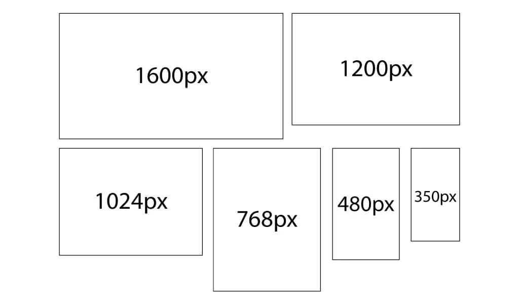
Responsive breakpoints
Extra Small Devices (Phones):
Max-width: 600px
Example:
CSS
@media only screen and (max-width: 600px) {
 /* Styles for extra small devices */
 }
Small Devices (Portrait Tablets and Large Phones):
Min-width: 600px
Example:
CSS
@media only screen and (min-width: 600px) {
 /* Styles for small devices */
 }
Medium Devices (Landscape Tablets):
Min-width: 768px
Example:
CSS
@media only screen and (min-width: 768px) {
 /* Styles for medium devices */
 }
Large Devices (Laptops/Desktops):
Min-width: 992px
Example:
CSS
@media only screen and (min-width: 992px) {
 /* Styles for large devices */
 }
Extra Large Devices (Large Laptops and Desktops):
Min-width: 1200px
Example:
CSS
@media only screen and (min-width: 1200px) {
 /* Styles for extra large devices */
 }
This breakpoints are not fixed rules but serve as a starting point. Adjust them based on your specific design requirements and the content you’re working with.

FAQ Questions
Answers to help you understand how work, collaboration, and results get delivered.
What makes 3oneseven different from other agencies?
Featuring a five-star track record in the design, setup & optimization of ecommerce stores.
Meet milo.
What information do you need from me before starting?
Details like objectives, brand assets, preferred styles, target audience, and any reference materials that help understand your vision better. Start now.
What industries do you work with?
From fresh startups to established global brands, we work with them all.
View client list.
How long does a project take?
Most projects are delivered in 4 to 8 weeks, however large migration projects tend to last uup to 3 months.
View migration service.
How do you handle international clients?
Collaborating with international teams across different time zones seamlessly.
Get to know milo.
Do you offer ongoing support?
Yes, providing maintenance and growth plans for different areas with various packages.
View all services.