
Understanding the anatomy of typefaces is essential for designers and typographers. View article at Anatomy of a Typeface Character
3oneseven
3oneseven
Last update at 13 · 05 · by milo
‧‧‧ One of 239Anatomy of a Typeface:
Fonts and typefaces are two different things: the typeface was the specific design of the letters, say Times New Roman or Baskerville; while the font referred to the particular size or style of that typeface, say 10 point regular or 24 point italic (each created as its own collection of cast metal letters and other characters).
Understanding the anatomy of typefaces is essential for designers and typographers.
Key components of a Typeface tharacter
Strokes, Curved Elements, Serifs, Height Measurements, typefaces are born from the delicate balance between rules and results. Each stroke, curve, and detail contributes to the overall appearance and legibility of a typeface.
Common typeface classifications
1
Serif Typefaces
Old Style: These typefaces originated between the late 15th and mid-18th centuries. They have a gentle contrast between thick and thin strokes, slightly angled serifs, and a diagonal cross stroke in the lowercase “e.”
Transitional: Developed in the mid-18th century, these typefaces bridge the gap between old style and neoclassical designs. They have more pronounced weight contrast and vertical stress.
Neoclassical & Didone: Created in the late 18th century, these typefaces have dramatic contrast, vertical stress, and thin hairlines. Giambattista Bodoni’s work exemplifies this style.
2
Sans Serif Typefaces
Grotesque: These sans serif fonts have a simple, geometric design with minimal variation in stroke width.
Humanistic: Inspired by handwriting, these typefaces have subtle variations and a more organic feel.
Geometric: Based on geometric shapes, these fonts have uniform stroke widths and a modern appearance.
3
Script Typefaces
Formal: Elegant and cursive, formal scripts are suitable for invitations and decorative purposes.
Casual: More relaxed and informal, casual scripts mimic handwriting.
Calligraphic: These typefaces imitate calligraphy with fluid strokes and flourishes.
4
Blackletter & Lombardic
Blackletter: Also known as Gothic or Fraktur, these typefaces have a medieval appearance with intricate details.
Lombardic: Similar to blackletter, Lombardic fonts were popular during the Renaissance.
5
Decorative Typefaces
Grunge: Distressed and irregular, grunge fonts evoke a worn or weathered look.
Psychedelic: Bold and unconventional, these fonts are associated with the psychedelic era.
Graffiti: Inspired by street art, graffiti fonts have a rebellious and urban vibe.
Remember that typeface choice impacts readability, mood, and overall design. Each classification serves different purposes and conveys distinct visual messages.
Typography article
Typography builds brand recognition
Typography is a interface design element
UI/UX design Guide
Anatomy of a Typeface Character
Style Guide 3oneseven
Typography & CSS
Typography Theme
Aperture
Opening at the end of an open counter
Arm
A horizontal stroke not connected on one or both ends.
Ascender
An upward vertical stroke found on lowercase letters that extends above the typeface’s x-height.
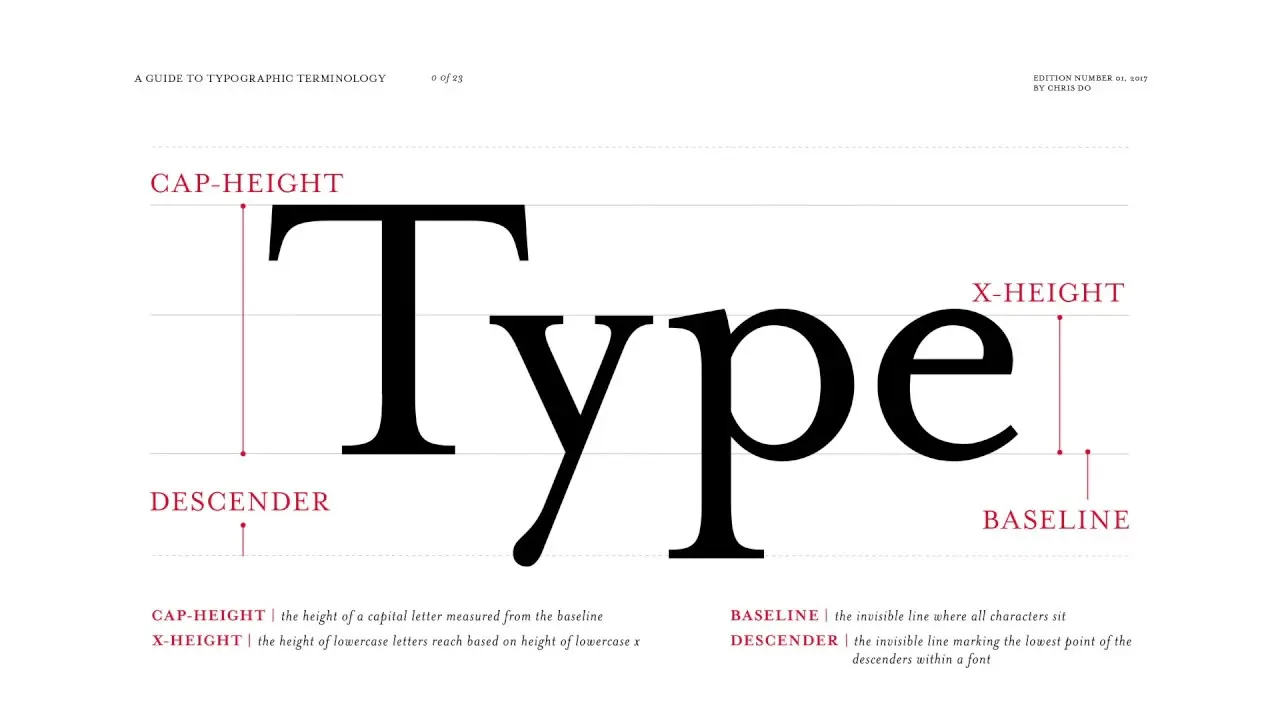
Baseline
The invisible line where letters sit.
Bowl
A curved stroke that encloses a letter’s counter.
Counter
Fully or partially enclosed space within a letter.
Crossbar
A horizontal stroke.
Descender
A downward vertical stroke found on lowercase letters that extends below the baseline.
Diagonal Stroke
An angled stroke.
Ear
A small stroke projecting from the upper right bowl of some lowercase g’s.
Finial
A tapered or curved end.
Hairline
The thin strokes of a serif typeface.
Ligature
Two or more letters are joined together to form one glyph.
Link
A stroke that connects the top and bottom bowls of lowercase double-story g’s.
Loop
The enclosed or partially enclosed counter below the baseline of a double-story g.
Lowercase
The smaller form of letters in a typeface.
Serif
“Feet” or non-structural details at the ends of some strokes.
Shoulder
A curved stroke originating from a stem.
Small Caps
Uppercase characters that appear as a smaller size than the capital height of a typeface. Short for “small capitals”.
Spine
The main curved stroke for a capital and lowercase s.
Spur
A small projection from a curved stroke.
Stem
Primary vertical stroke.
Tail
A descending stroke, often decorative.
Terminal
The end of a stroke that lacks a serif.
Uppercase
A letter or group of letters of the size and form generally used to begin sentences and proper nouns. Also known as “capital letters”.
x-height
The height of the main body of a lowercase letter.
Anatomy of a Typeface Character
The terminal (end) of an instroke or outstroke is often a serif or a stroke ending. A seriffed terminal may be described as a wedge, bulbous, teardrop, slab, etc., depending on the design of the type. Typefaces may be classified by their look, of which the weight and serif style – whether serif or sans-serif – are key features. Some designs also have spurs, which are smaller than serifs and appear on angles rather than at a terminal, as on e or G.
More info: Optimize online store performance Ecommerce designer & entwickler aus München milo 317 design Effectively optimize Shopify GEO + SEOFAQ Questions
Answers to help you understand how work, collaboration, and results get delivered.
What makes 3oneseven different from other agencies?
Featuring a five-star track record in the design, setup & optimization of ecommerce stores.
Meet milo.
What information do you need from me before starting?
Details like objectives, brand assets, preferred styles, target audience, and any reference materials that help understand your vision better. Start now.
What industries do you work with?
From fresh startups to established global brands, we work with them all.
View client list.
How long does a project take?
Most projects are delivered in 4 to 8 weeks, however large migration projects tend to last uup to 3 months.
View migration service.
How do you handle international clients?
Collaborating with international teams across different time zones seamlessly.
Get to know milo.
Do you offer ongoing support?
Yes, providing maintenance and growth plans for different areas with various packages.
View all services.